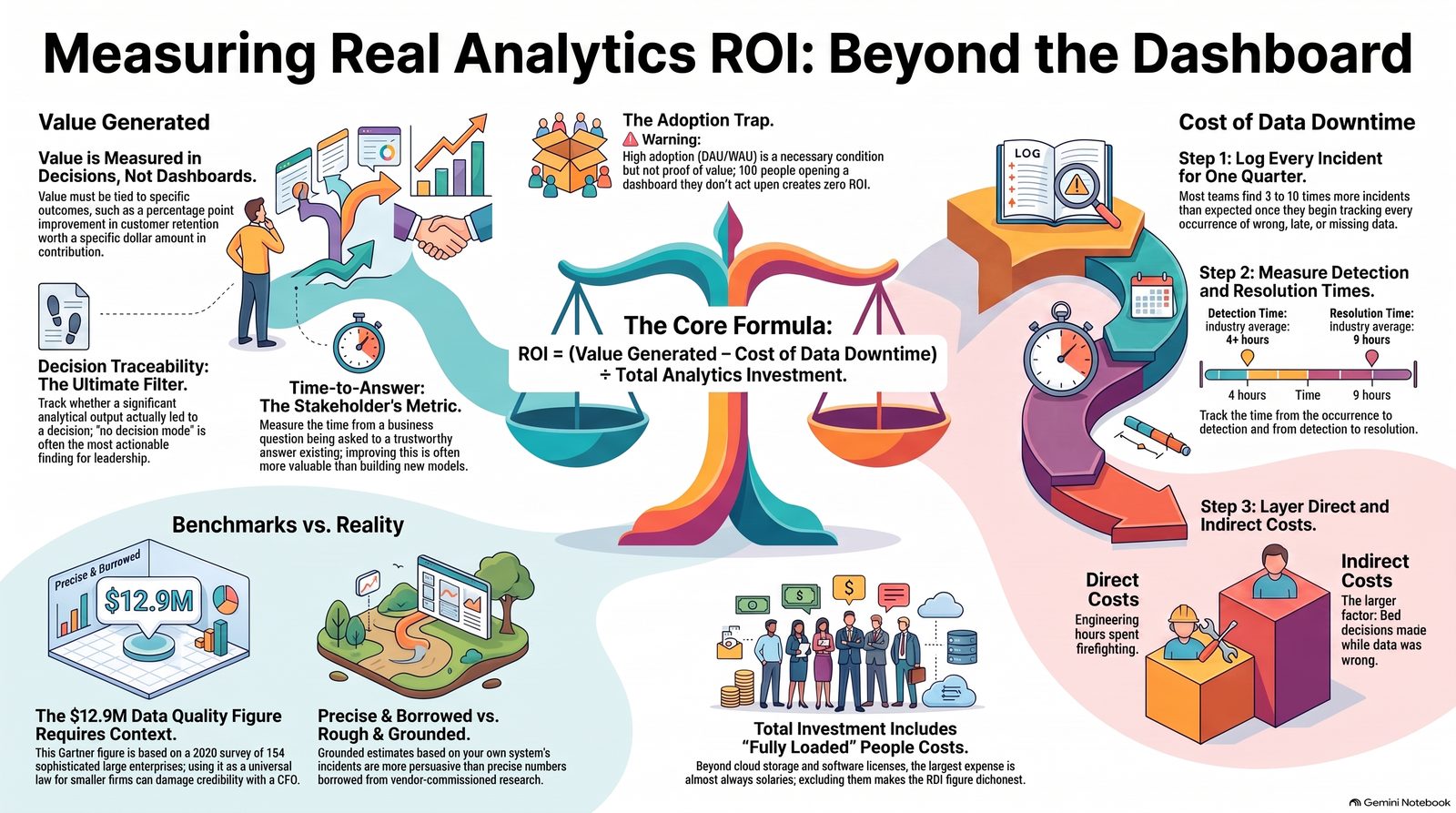
A defensible analytics ROI formula is (Value generated − Cost of data downtime) ÷ Total analytics investment, where value must be named in decision outcomes, not dashboards shipped. The widely-quoted $12.9 million data quality figure traces back to a 2020 Gartner survey of 154 already-sophisticated reference customers — worth citing as context, not as a universal law, while you build your own downtime number from your own incidents.
Analytics functions have an awkward measurement problem. They exist to help other people make better decisions, which means the value they create is always recorded in someone else's P&L. When budget season arrives, the marketing team can point to campaign returns and the sales team to closed revenue, while the analytics team points to a number of dashboards.
Dashboards are not value. Here is a more defensible approach.
Start with the formula, then interrogate it
A reasonable starting frame:
Analytics ROI = (Value generated − Cost of data downtime) ÷ Total analytics investment
Every term needs unpacking, and the unpacking is where the honesty lives.
Total analytics investment is the easy one, and the one most often understated. Platform licences, cloud compute and storage, ingestion and transformation tooling, and — the largest component almost everywhere — fully loaded people cost. If your figure does not include salaries, it is not an investment figure.
Value generated is the hard one, and it must be measured in decision outcomes rather than outputs. Not "we built a churn model" but "retention on the at-risk segment improved by X percentage points after the intervention, worth ₹Y in retained contribution". If you cannot name the decision and the person who made it, you have not measured value.
Cost of data downtime is the term most frameworks omit entirely, which is why analytics functions get blindsided when a quality incident erases a quarter of goodwill.
The famous number, handled honestly
Any business case you write will be tempted toward Gartner's estimate that poor data quality costs organisations an average of USD 12.9 million annually. It is quoted in more or less every vendor blog on the subject.
Its provenance is worth stating, because almost nobody does. The figure originates in Gartner's Magic Quadrant for Data Quality Solutions, published 27 July 2020. Gartner asked 154 reference customers across 16 data quality vendors to estimate what poor data quality cost their organisation.
So: an average of self-reported estimates, from a population of large enterprises already sophisticated enough to be purchasing data quality software, gathered in 2020.
That is not a criticism of Gartner, whose methodology was appropriate to its purpose. It is a criticism of how the number gets used. Presenting it as a universal benchmark to a CFO who then discovers its origin damages your credibility on everything else in the deck.
Related figures deserve the same treatment. Monte Carlo's 2022 survey with Wakefield Research — 300+ data professionals, 40% of time spent on data quality, 26% of revenue affected — is directionally useful and was commissioned by a data observability vendor. Say so. Your audience will trust the rest of your numbers more, not less.
Build your own downtime number
The number that persuades is the one from your own systems.
Step one: count incidents. For one quarter, log every occurrence where data was wrong, late, missing or misleading in a production asset. Include the ones caught internally. Most teams find three to ten times more than they expected, because unnoticed incidents were never counted.
Step two: measure the two durations. Time from occurrence to detection, and time from detection to resolution. Industry survey data suggests detection alone commonly takes four hours or more and resolution around nine, but your figures are what matter.
Step three: attach cost in two layers.
Direct: engineering hours consumed by firefighting, at fully loaded cost. Simple arithmetic, and usually smaller than expected.
Indirect: decisions made on wrong data during the exposure window. Harder, and usually much larger. For each incident, ask what decisions were made from that asset while it was wrong — and estimate the cost of the ones that were affected.
Data downtime cost = Σ (incident duration × decisions affected × cost per wrong decision)
The estimates will be rough. Rough and grounded beats precise and borrowed.
Metrics beyond the single formula
ROI as one number is a blunt instrument. Three supplementary measures give a sharper picture.
Adoption-based metrics. Weekly active users against licensed users. Share of dashboards opened in the last 30 days. The proportion of reported metrics that resolve to a governed semantic definition rather than a bespoke query. Low adoption is an early indicator of low value long before the ROI calculation catches up.
Decision traceability. For each significant analytical output, was a decision made, by whom, and what happened. Most entries will read "no decision was made" — and that finding, aggregated, is the most actionable thing an analytics leader can put in front of an executive team.
Time-to-answer. How long from a business question being asked to a trustworthy answer existing. This is the metric business stakeholders actually experience, and improving it is often more valuable than any individual model.
The trap in adoption metrics
One caution, because adoption is easy to game. A dashboard opened daily by a hundred people who then do exactly what they would have done anyway has high adoption and zero value.
Adoption is a necessary condition, not a sufficient one. Pair it with decision traceability or you are measuring habit rather than impact.
What to present, and how
A business case that survives scrutiny in an Indian enterprise budget review generally has this shape:
Open with your own downtime figures — incidents, detection time, and named business impacts from the last two quarters. Follow with a small number of decisions that measurably changed, with the value quantified conservatively and the assumptions stated. Reference industry benchmarks briefly and with provenance, positioned as context rather than proof. Close with what the requested investment will change, expressed in decision terms.
Conservative and sourced beats ambitious and borrowed. If your credibility survives the first quarter, you get to ask again.
The honest bottom line
Most analytics functions cannot compute their own ROI because they never instrumented stage six of the lifecycle — the loop that checks whether recommendations were adopted and whether the KPI moved.
That instrumentation costs a few hours a month. It is the highest-return work an analytics leader can do, and it is almost universally skipped in favour of building one more dashboard.
Conservative and sourced beats ambitious and borrowed. If your credibility survives the first quarter, you get to ask again.
Referenced in this piece: Monte Carlo — cost of data downtime research.
Want this level of rigor applied to your own analytics stack?
This guide comes from running BA/BI systems audits for real Indian enterprises — where the actual fix is decided by which stage of your analytics function is broken, not by which tool has the best demo. A Systems Audit tells you exactly where to start.
Book a Systems Audit arrow_forward